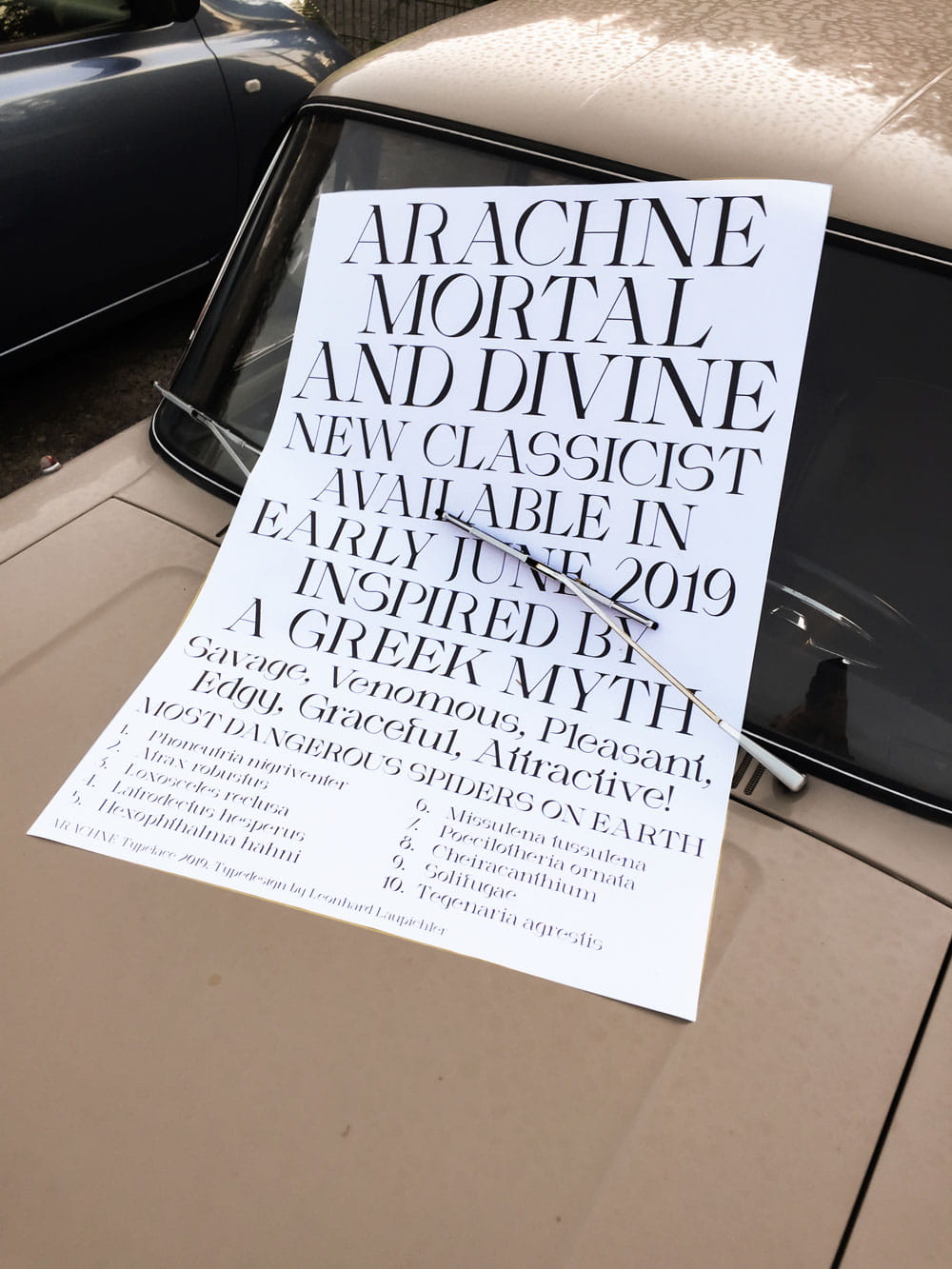
While working on Arachne, I was reinterpreting common elements of classicist typefaces, hence I chose to call it a new classicist typeface. Arachne’s strong character derives from the combination of soft strokes and sharp, pointy edges and it’s many eye catching details.
The dynamic curves and special axis add a soft but also dynamic character to Arachne’s classicist features. It combines various contrasting elements: Classicist and modern, thick and thin strokes and dynamic but also rigid shapes.
Developing Arachne also involved a lot of experimentation. I tried incorporating innovative, peculiar and flashy elements in order to create a characteristic and unique typeface without overdoing it. After finishing the typefaces regular cut, I created two more versions called „Demigod“ and „Divine“ which add a more playful character by gently exaggerating the typefaces special features.